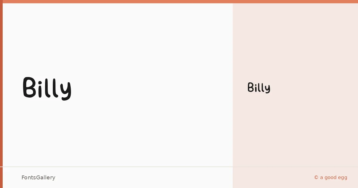
About Billy Font
There is an unmistakable looseness to this display face — the kind of hand-influenced energy that feels drawn rather than constructed. Claire Joines, working under the a good egg imprint, released it in 2022 as a single Regular weight, keeping the focus tight on its expressive character rather than spreading it across a range of cuts.
Design Aesthetics & Character Characteristics
Sitting squarely in the display category, the letterforms carry a modern yet whimsical personality — playful enough for a children's book title but controlled enough to anchor a logo or brand mark. The single Regular style arrives as a TTF, which means it drops cleanly into most design workflows without ceremony. What it lacks in weight range it compensates for in personality: this is not a workhorse face, it is a mood.
Recommended Usage & Font Pairing
It earns its place on greeting cards, social media graphics, branding projects, and anywhere a headline needs warmth without feeling juvenile. Its Latin coverage makes it a reliable choice across Western European copy. For pairing, the structured calm of Helvetica or Bahnschrift grounds it well in layouts that need contrast, while Canela brings a softer editorial counterpoint; Etna and AQUA offer more expressive companions when the brief calls for a fully illustrative palette.
License & Usage Terms
Billy is available under Personal Use terms — free for non-profit work, but a paid license is required for any commercial application, so confirm your usage terms with the designer before taking it into a client job.