About Betron Font
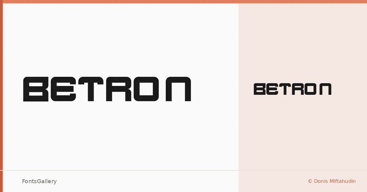
There is a hard-edged confidence to these letterforms — the kind of geometry that feels assembled from precise components rather than drawn with a loose hand. Donis Miftahudin of Din Studio built this single-weight display face with a futuristic attitude that sits somewhere between industrial construction and editorial cool.
Design Aesthetics & Character Characteristics
Betron sits firmly in the display category, offered as a single Regular cut in TTF format. The mood is bold and modern, with letterforms that carry enough visual weight to anchor a composition without needing multiple styles to do it. The geometry feels deliberate — this is a face that works through structure, not decoration.
Recommended Usage & Font Pairing
It earns its keep in branding systems, poster headlines, logo lockups, and T-shirt graphics — anywhere Latin-script type needs to arrive with authority. For contrast, the listed pairing options cover a useful range: Etna and ABC Arizona bring their own strong personalities, while Canela offers a softer editorial counterpoint, and Bahnschrift or Helvetica provide clean, neutral support in body or secondary roles.
License & Usage Terms
Betron is distributed under Personal Use terms — commercial use is not permitted, so confirm licensing before taking it into a client job by reviewing the agreement at din-studio.com/product/betron/.