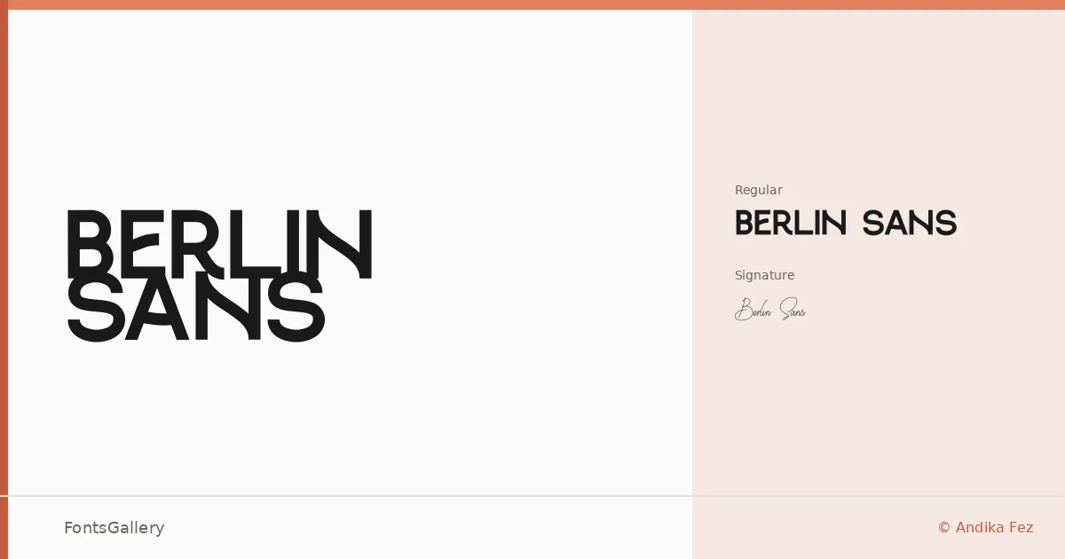
About Berlin Sans Font
There is a clean, deliberate authority to these letterforms — the kind of geometric confidence that comes from someone who has thought carefully about negative space. Designed by Andika Fez, the family ships in two distinct expressions: a straight-edged Regular and a fluid, expressive Signature Regular that introduces a handcrafted contrast to the same visual world.
Design Aesthetics & Character Characteristics
Both cuts sit firmly in the sans serif tradition, leaning into a modern, minimal sensibility with enough weight and presence to read as bold even in the standard cut. The Regular is built for structure — clean strokes, disciplined spacing, the kind of geometry that holds a headline without fuss. The Signature Regular breaks from that grid with a looser, more human energy, giving the pair a natural push and pull. Available in TTF, OTF, and WOFF, the family covers Latin script.
Recommended Usage & Font Pairing
Both styles are well-suited to branding systems, logotype work, poster headlines, and website headers where a professional, modern tone is expected. The Signature Regular earns its place on brand marks that want warmth alongside structure. When building out a layout, the family sits comfortably alongside Canela, Armelie, 321 Impact, AQUA, and Kactigona, each of which offers a different kind of contrast — editorial serif, script softness, or expressive weight.
License & Usage Terms
Berlin Sans is distributed under Personal Use terms, which means commercial use is not permitted — confirm licensing directly with the designer at [email protected] before deploying it in a commercial project. The font is licensed for installable embedding.