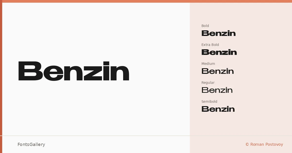
About Benzin Font
There is a deliberate tension in this family — the geometry is strict, almost mechanical, yet the proportions feel considered rather than cold. Designed by Roman Postovoy, it spans four weights plus an extra bold cut: Regular, Medium, Semibold, Bold, and ExtraBold, all delivered as TTF files. The letterforms carry wide, even spacing and squared-off terminals that give headlines a confident, unhurried presence.
Design Aesthetics & Character Characteristics
This is a minimal, modern sans serif built for situations where clarity and weight need to coexist. The progression from Regular through ExtraBold is smooth enough that you can mix cuts within a layout without the jumps feeling arbitrary. Latin and Cyrillic coverage means the same controlled geometry holds across both scripts, which matters when multilingual consistency is part of a brief. The overall mood lands firmly in professional and bold territory — nothing decorative, nothing soft.
Recommended Usage & Font Pairing
The heavier cuts — Bold and ExtraBold — were made for poster headlines, logo lockups, and advertising display work where impact at large sizes is the whole point. The lighter weights, Medium and Regular, carry branding copy and subheadings without losing the family's structural character. It pairs naturally with editorial serifs like Canela for contrast, or alongside display faces such as Kactigona and 321 Impact for a more aggressive visual register; Armelie and AQUA offer softer counterpoints when the layout calls for it.
License & Usage Terms
Benzin is available under Personal Use terms, which means commercial use is not permitted — confirm licensing directly with the designer before applying it to any client or revenue-generating work. Embedding is limited to preview and print only.