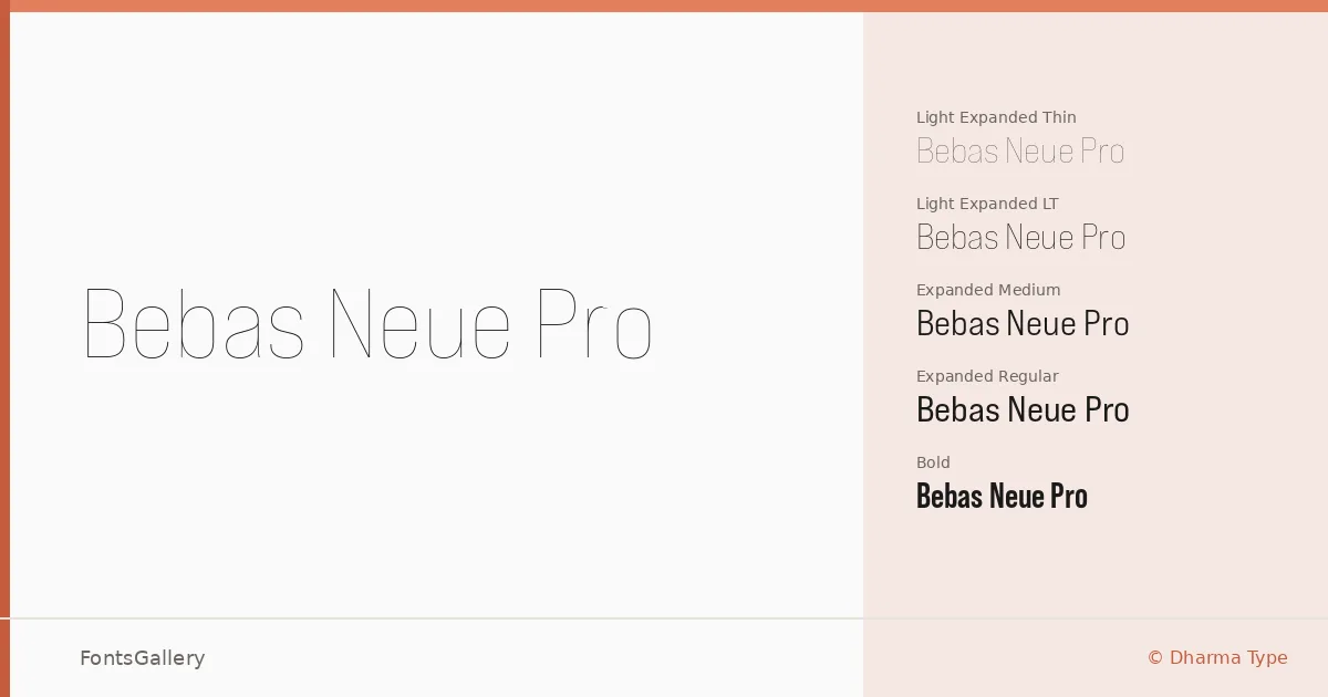
About Bebas Neue Pro Font
Ryoichi Tsunekawa of Dharma Type built this family on the bones of a workhorse display face and then pushed it considerably further — into italics, condensed widths, expanded widths, and a weight range that runs from Thin through Bold with multiple intermediate stops. The uppercase geometry is tight and flat-capped, the kind of all-caps construction that holds its nerve at large sizes without feeling crude.
Design Aesthetics & Character Characteristics
This is a display family through and through — bold, minimal, and built for scale. The full set spans Thin Regular and Italic, Book Regular and Italic, a Middle weight, Bold, and Semi Bold cuts alongside Expanded and Condensed variants in their own upright and italic pairings, all delivered as OTF files. The condensed styles press letterforms into tight vertical columns, while the expanded cuts open the architecture into something more monumental. Italics across the range carry a decisive slant that avoids the mechanical awkwardness many geometric display faces suffer at oblique angles.
Recommended Usage & Font Pairing
The family earns its keep in headline settings, posters, advertising campaigns, and brand identity work where a modern, professional voice needs to read at distance or at scale. For running text alongside it, the named pairings lean toward complementary contrast: Helvetica and Asap bring neutral utility, Canela introduces editorial warmth, while Etna and AQUA offer more distinctive counterpoints depending on the mood of the project.
License & Usage Terms
The files here are released under a Demo license — commercial use is not permitted, so confirm licensing terms directly with Dharma Type at dharmatype.com before deploying this family in a paid job. Embedding is set to installable.