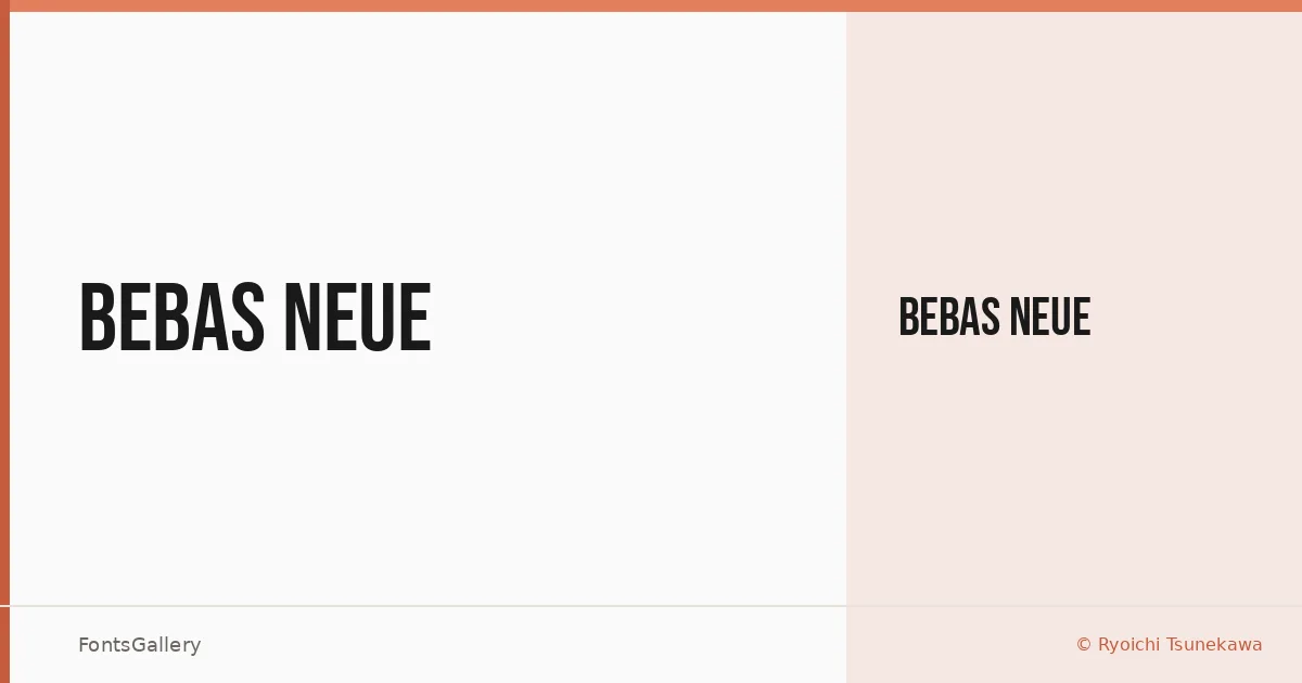
About Bebas Neue Font
There is a particular confidence in all-capitals display type when every letter stands at exactly the same height and nothing apologizes for taking up space. Ryoichi Tsunekawa of Dharma Type built this face on that premise — tall, tightly set, and stripped of any decorative noise. The geometry is clean without feeling cold, and the strokes carry just enough weight to anchor large-scale settings without collapsing into blackness.
Design Aesthetics & Character Characteristics
This is a display typeface in the modern, minimal tradition — the kind of uppercase-only design that earns its boldness through proportion rather than embellishment. The single style available is Regular, offered in TTF format, and it sits at a register that reads simultaneously professional and direct. The letterforms have a compressed, architectural quality: vertical stress, uniform cap height, and open counters that survive aggressive tracking or tight setting equally well.
Recommended Usage & Font Pairing
It earns its keep in headlines, posters, branding systems, logotype treatments, and anywhere a t-shirt or campaign needs a voice without clutter. Latin character coverage covers the expected Western European workload. For body text or supporting copy, it pairs naturally with Helvetica or Bahnschrift to stay in the rational-sans register, while Canela brings a contrasting editorial warmth; Etna and AQUA offer bolder, more expressive companions when the layout calls for personality at every scale.
License & Usage Terms
Bebas Neue is released under the SIL Open Font License, Version 1.1, which explicitly allows commercial use — full details and FAQ are at http://scripts.sil.org/OFL. The font is licensed with installable embedding permissions, so it can travel inside documents and applications without additional clearance.