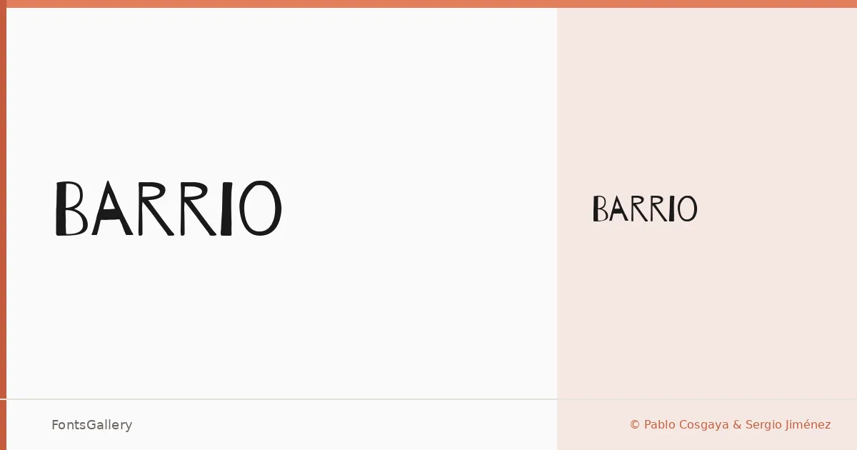
About Barrio Font
There is a rawness to this face that feels deliberate and controlled at once — the kind of hand-drawn energy that looks like it was lifted off a wall rather than constructed at a desk. Pablo Cosgaya and Sergio Jiménez built it with a grunge sensibility that carries genuine texture, not a digital approximation of one. The single Regular weight is available in OTF format, and within that one cut there is enough character to carry a composition entirely on its own.
Design Aesthetics & Character Characteristics
Sitting firmly in the Display category, the letterforms read as rustic and playful in equal measure, with an underlying vintage quality that keeps the whole thing from feeling throwaway. The strokes have irregular edges and an ink-on-surface warmth that rewards larger settings — the roughness becomes richer the more room it gets to breathe. It covers Latin script, so standard Western European character needs are well handled.
Recommended Usage & Font Pairing
This is a face for jobs where attitude is part of the brief: poster headlines, packaging labels, T-shirt graphics, branding that needs to feel lived-in rather than polished, and social media imagery that wants to stand apart from the clean and corporate. Because the texture is so dominant, it pairs well with something that gives it a clean counterpoint — Helvetica or Asap keep things grounded and legible at smaller sizes, while Canela or Etna bring a more editorial contrast. AQUA is worth considering when a secondary display voice is needed without the formality of a text face.
License & Usage Terms
Barrio is released under the SIL Open Font License, which allows commercial use freely. The embedding permission is set to editable, so the font can be embedded in documents that others may modify.