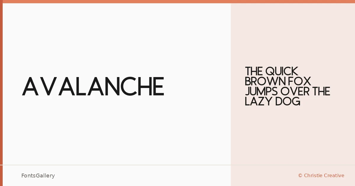
About Avalanche Font
There is a controlled weight to the letterforms here — a sans-serif built with restraint, where every stroke feels deliberate rather than decorative. Alexa Christie, working under the Christie Creative label, drew this face as a single Regular cut, keeping the focus tight and the intention clear.
Design Aesthetics & Character Characteristics
The mood sits squarely at the intersection of bold and minimal: clean geometry, professional composure, and a modern edge that reads well at large sizes. Delivered in both TTF and OTF formats, the family ships as a single Regular weight, which means the design carries its presence through form alone rather than a range of grades. That kind of economy suits display work well — the letterforms hold their shape whether they're cropped into a logo lockup or set at poster scale.
Recommended Usage & Font Pairing
This is a face built for high-visibility settings: brand identities, headline treatments, logo marks, poster compositions, and website headers where the type needs to land immediately and hold attention. For pairing, the designers behind the catalog suggest combining it with Canela, Armelie, 321 Impact, ABC Arizona, or Kactigona — a range that covers editorial serifs, script accents, and heavier display cuts, giving you room to build contrast without fighting the primary voice.
License & Usage Terms
Avalanche is released under a Personal Use license, which means commercial work is not permitted under these terms — confirm clearance with Christie Creative before applying it to any client or revenue-generating project. Embedding is set to installable.