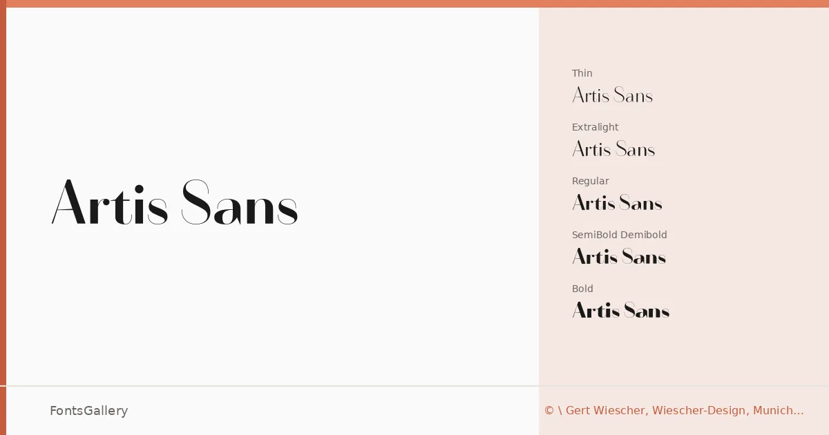
About Artis Sans Font
There is a quiet self-assurance to this family — the kind that comes from a designer who knows exactly when to stop adding. Gert Wiescher of Wiescher-Design in Munich built twelve cuts across two companion subfamilies: a straight-sided geometric sans and a subtly swung companion that introduces gentle optical movement without breaking the minimal mood. The letterforms are clean and open, with spacing that keeps text airy even at smaller sizes.
Design Aesthetics & Character Characteristics
The family runs from Thin and ExtraLight through Light, Regular, and Demibold to Bold — each weight available in both the standard and Swing variants — giving you a controlled but expressive range. The overall register sits squarely in elegant, modern territory: high contrast between thin and heavier weights, economical stroke endings, and just enough personality in the Swing cuts to lift a headline without undermining the luxury restraint of the standard ones. All styles are delivered as OTF files.
Recommended Usage & Font Pairing
The weight range and measured elegance make this a natural fit for branding work, logo lockups, website headers, magazine layouts, and business cards where a polished, minimal presence is the goal. For pairing, the listed recommendations include Canela, Armelie, 321 Impact, AQUA, and Kactigona — combinations that would work well wherever you need a contrasting serif or decorative companion to anchor the cleaner geometric forms here.
License & Usage Terms
This font is available under a Demo license governed by the Wiescher Design Standard License, which does not permit commercial use — confirm licensing directly with Wiescher-Design before deploying it in a paid or client-facing project. Embedding is permitted in documents for viewing and printing, but embedding into software or hardware products requires a separate OEM agreement.