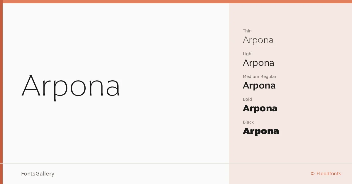
About Arpona Font
There is a quiet confidence to the letterforms here — clean strokes, restrained contrast, and proportions that hold their composure across the full weight range. Felix Braden of Floodfonts drew this sans serif with a clarity that reads as modern without chasing trends. The family ships in OTF format and covers Thin through Black, each weight paired with a matching italic.
Design Aesthetics & Character Characteristics
Eighteen styles — Thin through Black, with upright and italic cuts at every step — give the family a disciplined, systematic feel that suits professionals who need a consistent voice across a project. The overall mood is minimal and elegant: nothing decorates what does not need to be decorated. At lighter weights the forms feel almost delicate; push into SemiBold, ExtraBold, or Black and the same geometric restraint simply becomes more insistent.
Recommended Usage & Font Pairing
The combination of professional tone and weight depth makes it a natural fit for branding systems, business cards, magazine layouts, presentation decks, and website headers where hierarchy matters. For contrast in editorial work it pairs well with Canela or Armelie; for something more assertive alongside it, 321 Impact, AQUA, or Kactigona each offer a different kind of counterpoint.
License & Usage Terms
This family is offered under a Demo license, which does not allow commercial use — confirm clearance before taking it into any client or revenue-generating work. Embedding is permitted for preview and print only.