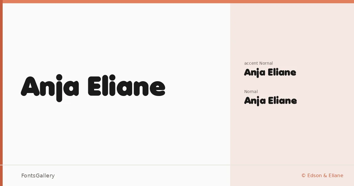
About Anja Eliane Font
There is a clean, deliberate confidence to these letterforms — the kind that comes from a sans serif designed with display work firmly in mind. The family is the work of Edson & Eliane, and it arrives in two cuts: a standard Regular and an accented Regular variant, both in TTF format, covering Latin with partial character support.
Design Aesthetics & Character Characteristics
The overall character sits at the intersection of minimal and playful — modern in its stripped geometry yet warm enough to avoid feeling cold on a page. With two styles built around a single expressive weight, the family leans into bold headline territory rather than trying to cover every text scenario. The forms hold their own at large sizes, where the underlying playfulness in the construction becomes most readable.
Recommended Usage & Font Pairing
This is a family that earns its place in branding systems, poster headlines, logo lockups, and social media graphics where a modern, confident voice is called for. The partial Latin coverage is worth checking against your specific character needs before committing to a multilingual project. For pairing, the contrast-rich serif of Canela makes a natural counterpart, while Armelie, 321 Impact, AQUA, and Kactigona each offer different tonal possibilities depending on how much energy you want to bring to the layout.
License & Usage Terms
Anja Eliane is available for commercial use under its stated license, with installable embedding permissions included.