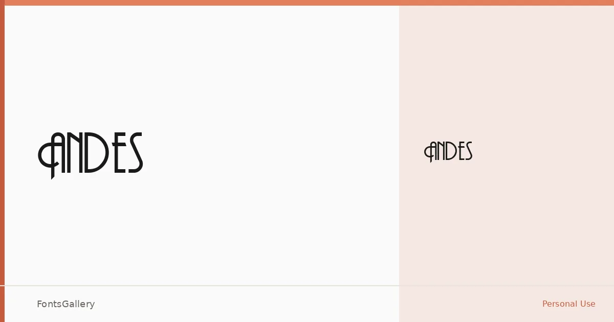
About Andes Font
There is a quiet confidence to the letterforms here — the kind of high-contrast elegance that sits comfortably between vintage editorial and contemporary luxury branding. The family ships as a single cut, Thin Regular, in TTF format, which means the weight does all the work: open, airy, and refined rather than typographically dense.
Design Aesthetics & Character Characteristics
This is a display face with a modern sensibility and a deliberate nod to an earlier era of typesetting — the proportions feel considered and unhurried. The Thin Regular weight leans toward headline and logotype use rather than continuous text, carrying a mood that reads as both luxurious and precise. Latin script is supported, though coverage is partial, so extended character set work should be checked against your copy before committing.
Recommended Usage & Font Pairing
It suits contexts where a single well-chosen word or phrase carries the composition: magazine mastheads, poster headlines, brand marks, and logotypes where elegance is the brief. For body text or secondary hierarchy, it pairs well alongside Canela, Helvetica, or Bahnschrift; for a complementary display pairing, Etna and AQUA are both listed companions worth exploring.
License & Usage Terms
Andes is available under Personal Use terms — commercial use is not permitted, so confirm licensing with the rights holder before deploying it on a client project. Embedding is permitted at the installable level.