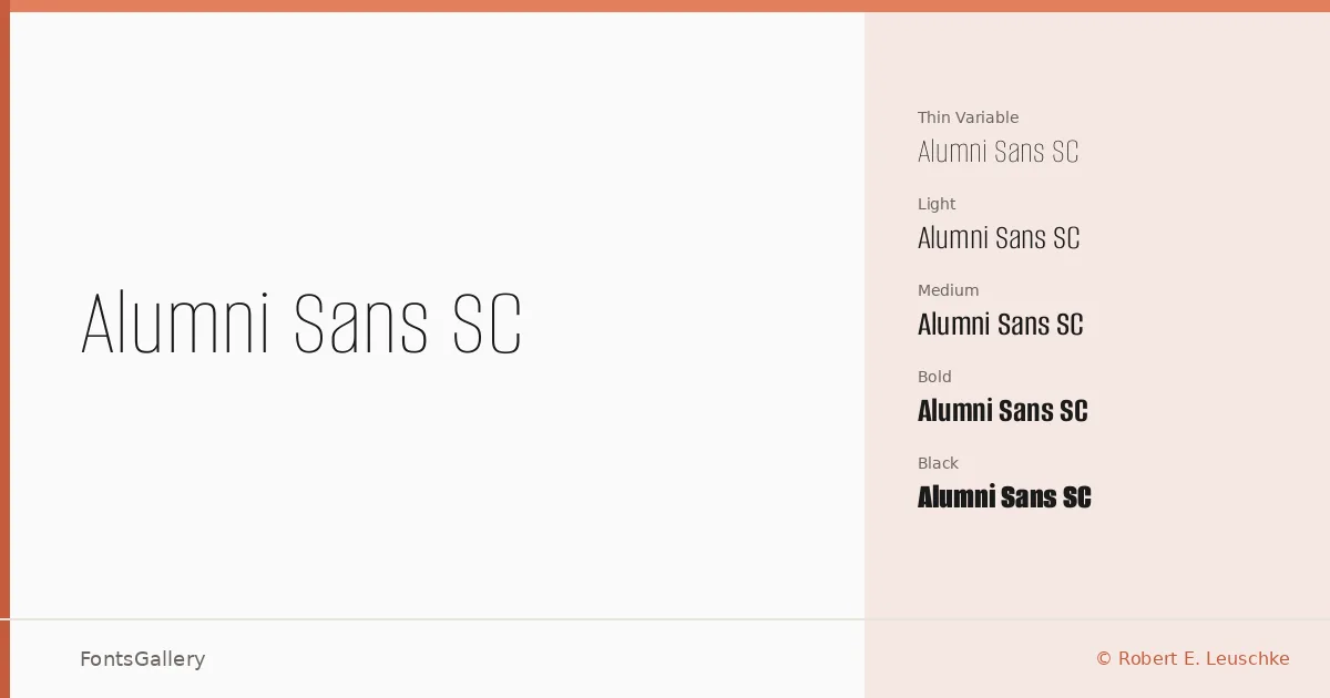
About Alumni Sans SC Font
Small caps built into a sans — that is the first thing you notice when you sit with these files. Robert E. Leuschke of typesetit.com drew this family with genuine small-capital letterforms woven throughout, rather than optically scaled imposters, giving even a single line of text a composed, editorial authority. The result is a clean, low-contrast sans that carries its weight quietly and precisely.
Design Aesthetics & Character Characteristics
The family spans a serious range: Thin and Thin Italic through Black and Black Italic, with every intermediate weight — ExtraLight, Light, Regular, Medium, SemiBold, Bold, ExtraBold — paired with an italic, plus variable fonts covering the full axis in both upright and italic. That breadth lets the family behave elegantly at delicate display sizes and hold its own as a professional headline weight within the same layout. The mood across the range reads as minimal and modern, the kind of measured restraint that suits considered branding work. Coverage extends across Latin and Latin Extended (partial), Cyrillic, and Vietnamese, which opens the family to a genuinely broad editorial reach. Files ship in TTF format, with installable embedding permission.
Recommended Usage & Font Pairing
This is a family that earns its place in magazine headers, website headers, brand identity systems, and presentation decks — anywhere the small-cap structure can give hierarchy without resorting to size alone. For pairing, the family works in contrast with the bracketed warmth of Canela or ABC Arizona on the serif side, and holds its own alongside Armelie, 321 Impact, or Kactigona when the job calls for mixed-sans tension. The variable axis makes it especially practical for responsive web contexts where a single file needs to serve multiple weights fluidly.
License & Usage Terms
Alumni Sans SC is released under the SIL Open Font License, Version 1.1, which allows commercial use — full terms and FAQ are available at https://openfontlicense.org.