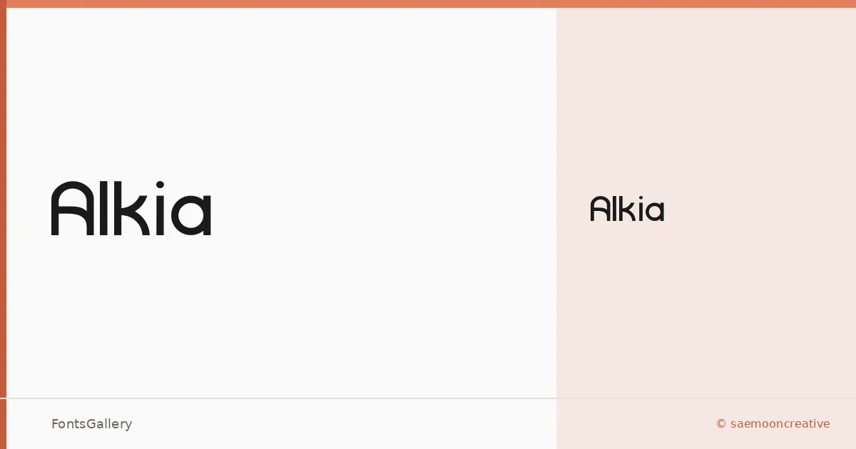
About Alkia Font
There is a studied restraint to this sans serif — clean terminals, measured spacing, and a geometry that keeps the eye moving without demanding attention. It comes from saemooncreative and was built in FontCreator 11. The single Regular weight is the whole family, so what you see is exactly what you work with.
Design Aesthetics & Character Characteristics
The category is sans serif, and the mood sits firmly in minimal and modern territory — the kind of professional neutrality that holds its shape whether it is set large or small. Because there is only one cut, proportion and spacing carry all the expressive weight, and both feel considered rather than accidental. It ships as a TTF with installable embedding permissions, covering the Latin script.
Recommended Usage & Font Pairing
The design reads naturally at the scale of a logo, a business card, or a website header, and it brings the same composed quality to presentation slides and branding systems. When you need contrast in a layout, it has been paired with Canela for editorial warmth, Armelie and Kactigona for script contrast, 321 Impact for weight drama, and AQUA for a complementary geometric sensibility.
License & Usage Terms
Alkia is released under a Personal Use license, and commercial use is not permitted — confirm rights with saemooncreative before taking it into any client or commercial work.