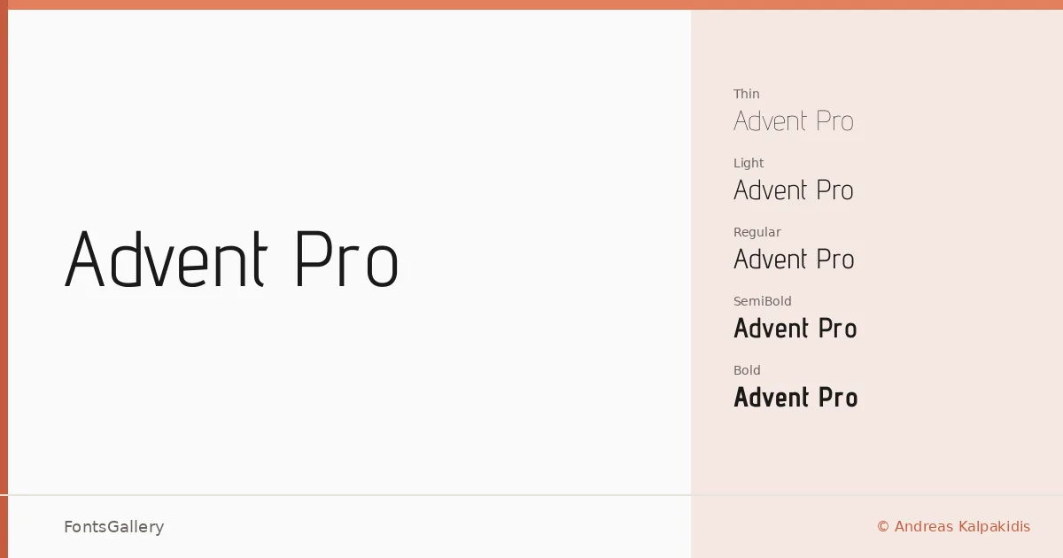
About Advent Pro Font
There is a particular clarity to the strokes here — tight spacing, open apertures, and a geometry that stays warm without tipping into cold neutrality. Advent Pro was drawn by Andreas Kalpakidis and covers both the Latin and Greek scripts, which makes it genuinely useful for multilingual work rather than an afterthought. The letterforms are built around consistent proportions that hold up whether you're setting a single display word or filling a longer headline block.
Design Aesthetics & Character Characteristics
This is a geometric sans serif running from Thin through Bold — seven weights in all: Thin, ExtraLight, Light, Regular, Medium, SemiBold, and Bold — each delivered as TTF files. The mood reads as minimal and modern with a measured elegance, the kind of restraint that feels professional without becoming sterile. The lighter cuts have an almost editorial delicacy, while the heavier weights carry enough mass to anchor a headline without forcing the issue.
Recommended Usage & Font Pairing
It earns its place in branding systems, magazine layouts, presentation decks, and website headers — anywhere the Greek and Latin coverage needs to work together seamlessly in the same paragraph. The controlled proportions pair well with more expressive or high-contrast faces; the named companions include Canela, Angeletta, ABC Arizona, Armelie, and Minecraft, each offering a different kind of counterbalance depending on whether you want editorial warmth, script contrast, or something more playful.
License & Usage Terms
Released under the SIL Open Font License (OFL), Version 1.1, which permits commercial use and allows installable embedding — full terms and FAQ are at http://scripts.sil.org/OFL.