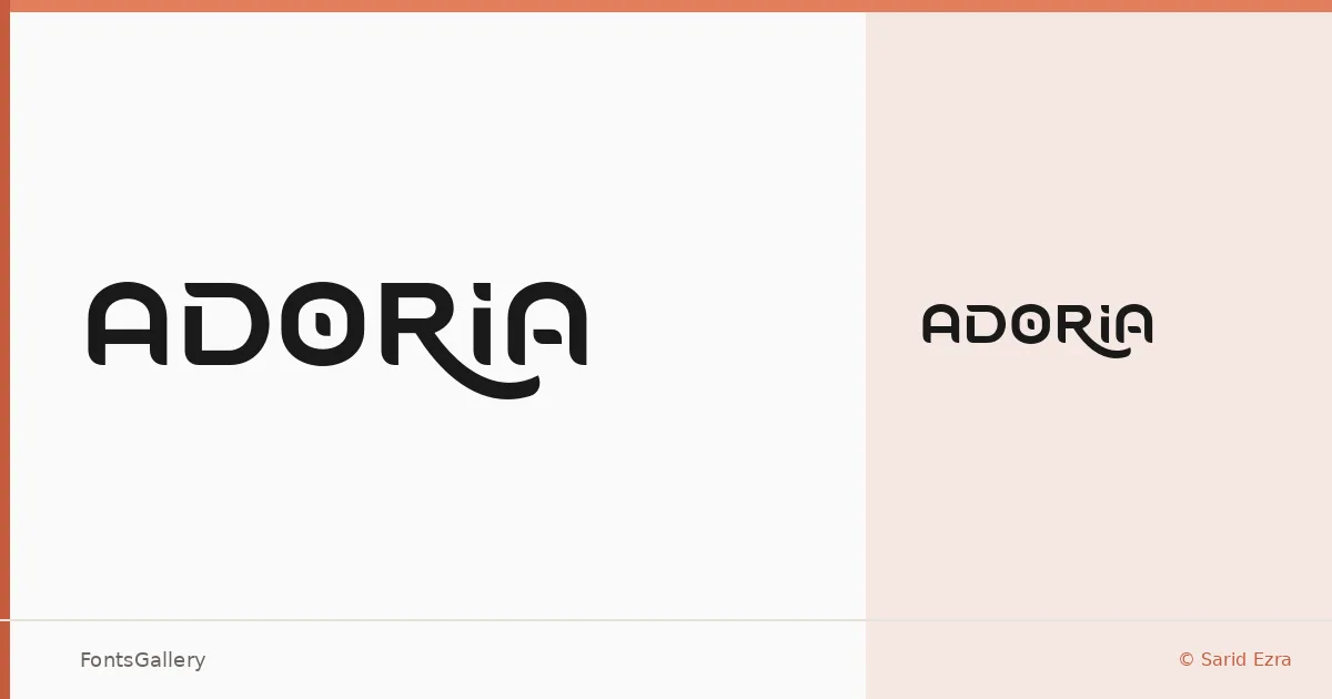
About Adoria Font
There is a controlled elegance to this display face — the kind that comes from restraint rather than decoration. Designed by Sarid Ezra, Adoria arrives as a single Regular weight in OTF format, its letterforms carrying a minimal, modern sensibility that reads as considered rather than spare.
Design Aesthetics & Character Characteristics
Sitting firmly in the display category, the design leans into clean lines and an understated elegance that keeps headlines feeling composed rather than busy. That minimal quality means the forms don't compete with imagery or surrounding elements — they anchor a layout without overwhelming it. A single Regular cut keeps the proposition focused: this is a face built for impact through refinement, not weight range.
Recommended Usage & Font Pairing
It earns its keep in branding, logo lockups, poster headlines, and social media graphics where a modern, editorial tone is the goal. Paired against something with more texture or mass — Canela and Etna both offer that contrast well — it finds a natural balance. Cleaner companions like Helvetica or Bahnschrift keep things strictly contemporary, while AQUA can add a complementary decorative dimension when the brief calls for it.
License & Usage Terms
Adoria is offered under a Demo license, which covers personal use only — confirm licensing with Sarid Ezra directly before deploying it in any commercial work.