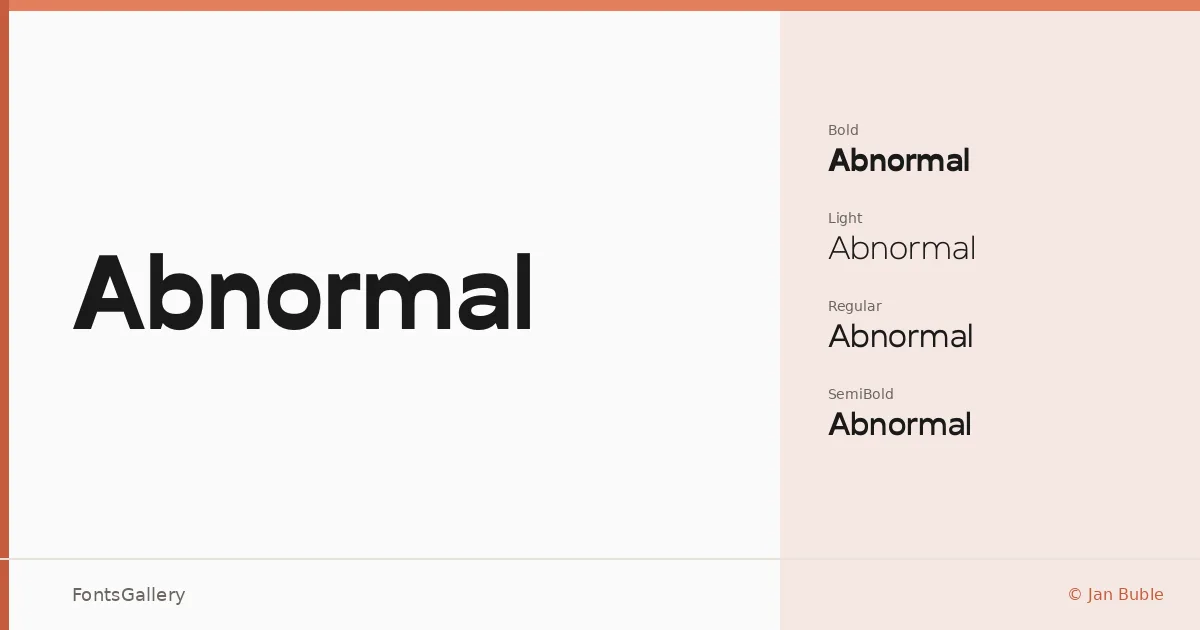
About Abnormal Font
There is a quiet confidence to Jan Buble's geometric sans — clean terminals, controlled proportions, and just enough personality to keep it from disappearing into the background. Released under copyright in 2014, it covers Latin and arrives as OTF files across four weights.
Design Aesthetics & Character Characteristics
The family runs Light through Bold — Light, Regular, SemiBold, and Bold — giving you a compact but useful range for building typographic hierarchy. The overall mood is minimal and modern, with a professional restraint that holds up well at large sizes without feeling cold. Each weight maintains even stroke rhythm, so stepping between cuts feels deliberate rather than mechanical.
Recommended Usage & Font Pairing
The weight range makes it a natural fit for branding systems, magazine headers, logo lockups, and website headers where clarity under pressure matters. For contrast-driven pairings, the listed companions span different personalities: the editorial warmth of Canela, the script fluidity of Armelie, the impact-driven geometry of 321 Impact, the display boldness of AQUA, and the structural angularity of Kactigona — any of these can set up an interesting tension against Abnormal's measured neutrality.
License & Usage Terms
This family is distributed under Personal Use terms, which means commercial use is not permitted — confirm licensing directly with Jan Buble before using it in a client or revenue-generating context. Embedding is limited to preview and print only.