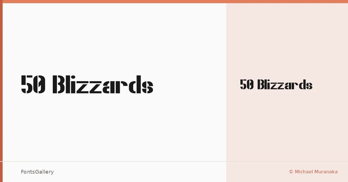
About 50 Blizzards Font
There is a rawness to these letterforms — something between a weathered stencil and a hand-inked poster that has spent time on a brick wall. Designed by Michael Muranaka, the family arrives as a single Regular Normal cut in TTF format, built with a confidence that makes that single weight feel complete rather than sparse. The grunge texture is deliberate and controlled, never accidental.
Design Aesthetics & Character Characteristics
This is a display face with a bold, modern edge that also carries genuine vintage character — the kind of tension that makes a headline feel like it means something. The forms read as grunge without becoming illegible, holding their structure even at large sizes. Latin character coverage keeps it focused on the jobs it was actually drawn for: big, loud, atmospheric type.
Recommended Usage & Font Pairing
It earns its place in branding, poster work, logo lockups, and T-shirt design — anywhere the headline needs to carry weight and attitude simultaneously. Pair it with something clean to let the texture breathe: Helvetica or Bahnschrift will ground it with neutrality, while Canela brings a contrasting editorial softness. Etna and AQUA offer more expressive alternatives if the whole composition needs to stay in a display register.
License & Usage Terms
This family is available under Personal Use terms — confirm licensing with the designer before placing it in any commercial work. The file is set with editable embedding permissions.